There is a difference between an image working as a concept and the image working in practice. Often times we see concepts that look great on paper but because they were missing 1 key consideration the design becomes functionally much less effective in use. That key consideration is ASPECT RATIO. Aspect ratio is simply the width of the image compared to the height of the image. For example a 1:1 aspect ratio means that the width of the image is the same as the height. For every 1 unit wide the image is, it is also 1 unit tall. An aspect ratio of 16:9 means that for every 16 units wide the image is, it is 9 units tall. 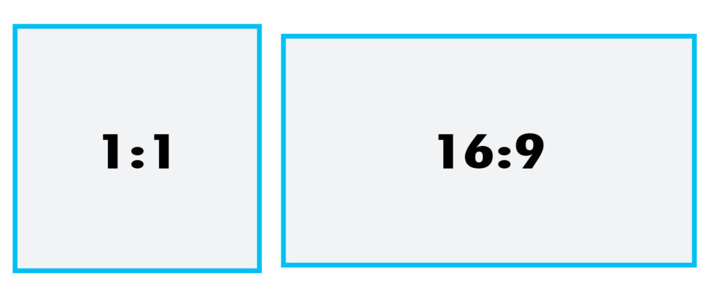
Why does Aspect Ratio matter?
Because depending on how your intended audience views the image they may not get the full effect of your concept. Different platforms have different aspect ratios and whenever you can, you should ask what the main platform for delivering your image will be. For example, Instagram is a great social platform for sharing images. Because Instagram is designed to be used as a mobile app viewed in a vertical orientation they have chosen a default aspect ratio of 1:1 for displaying images. This allows them to have images that fill the entire width of the screen while leaving room above and below the image for other content.
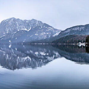
The image below is a beautiful panoramic landscape photo. It works very well in the intended wide aspect ratio. If we crop the aspect ratio to 1:1 however, the image loses all of its context and does not work the same way at all.

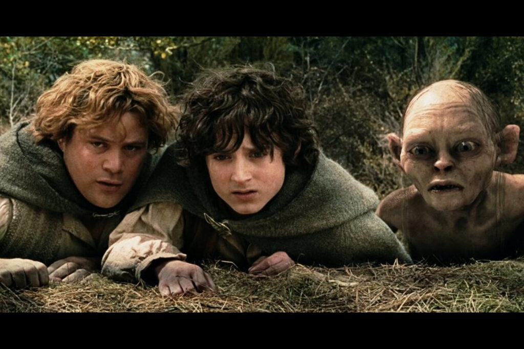
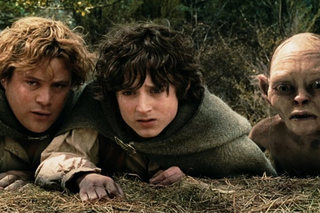
Similarly, most modern televisions display a 16:9 aspect ratio. Most movies are shot in a 2.35:1 aspect ratio though because they were designed to be displayed on a wider movie screen. When you watch that movie at home some adjustments need to be made in order to view it on a 16:9 screen. Typically the movie is either displayed at the correct width which means there will be blank space above and below the image (The black bars we are all familiar with). Or, it is displayed at the correct height which allows it to fill the entire screen but means the sides of the original image are cut off.
Think of your platform.
When we are creating an ad or a social media post or simply displaying an image to our audience it is very important to think about how the viewer will ultimately see the final content. If the aspect ratio of the format is not taken into account beforehand, you could end up needing to make some less than ideal concessions. The intended message of the image could be altered such as the movie stills above or the intended message could be lost altogether such as with the landscape photo.
When you intentionally build a design around the aspect ratio of the format it is to be displayed on you can be sure that the message will be delivered in exactly the way you intended. We can go a step further and even create designs and images that are flexible enough to work on multiple aspect ratios.
Below you can see the same concept that is designed to work in a wide OR square aspect ratio. Keeping multiple potential aspect ratios in mind when designing can help create more flexible designs that still function well across multiple platforms.
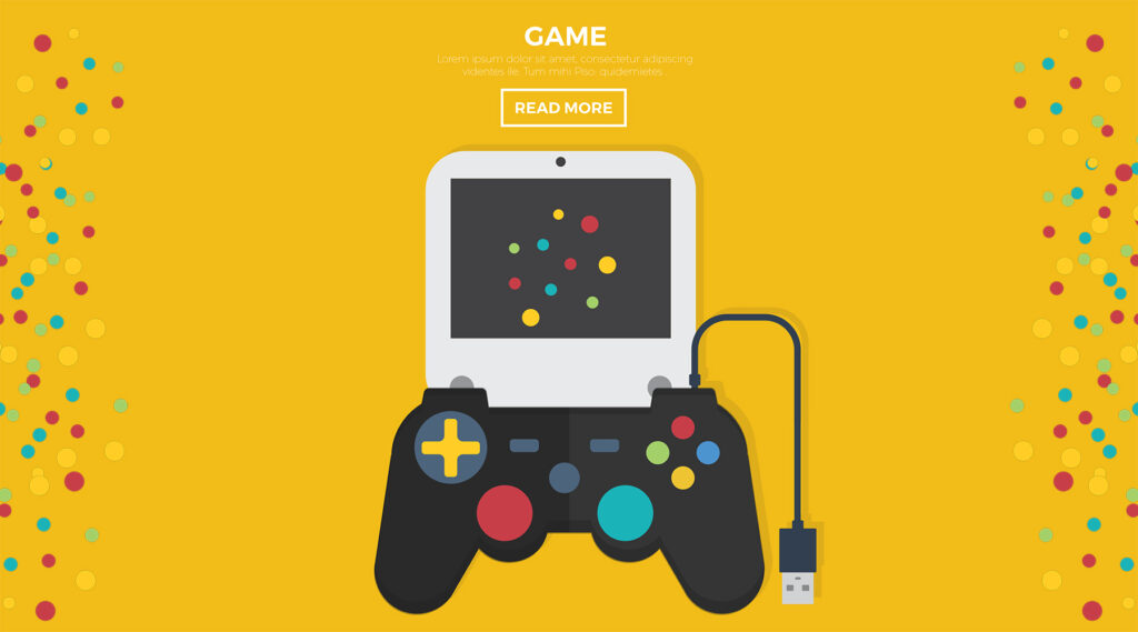
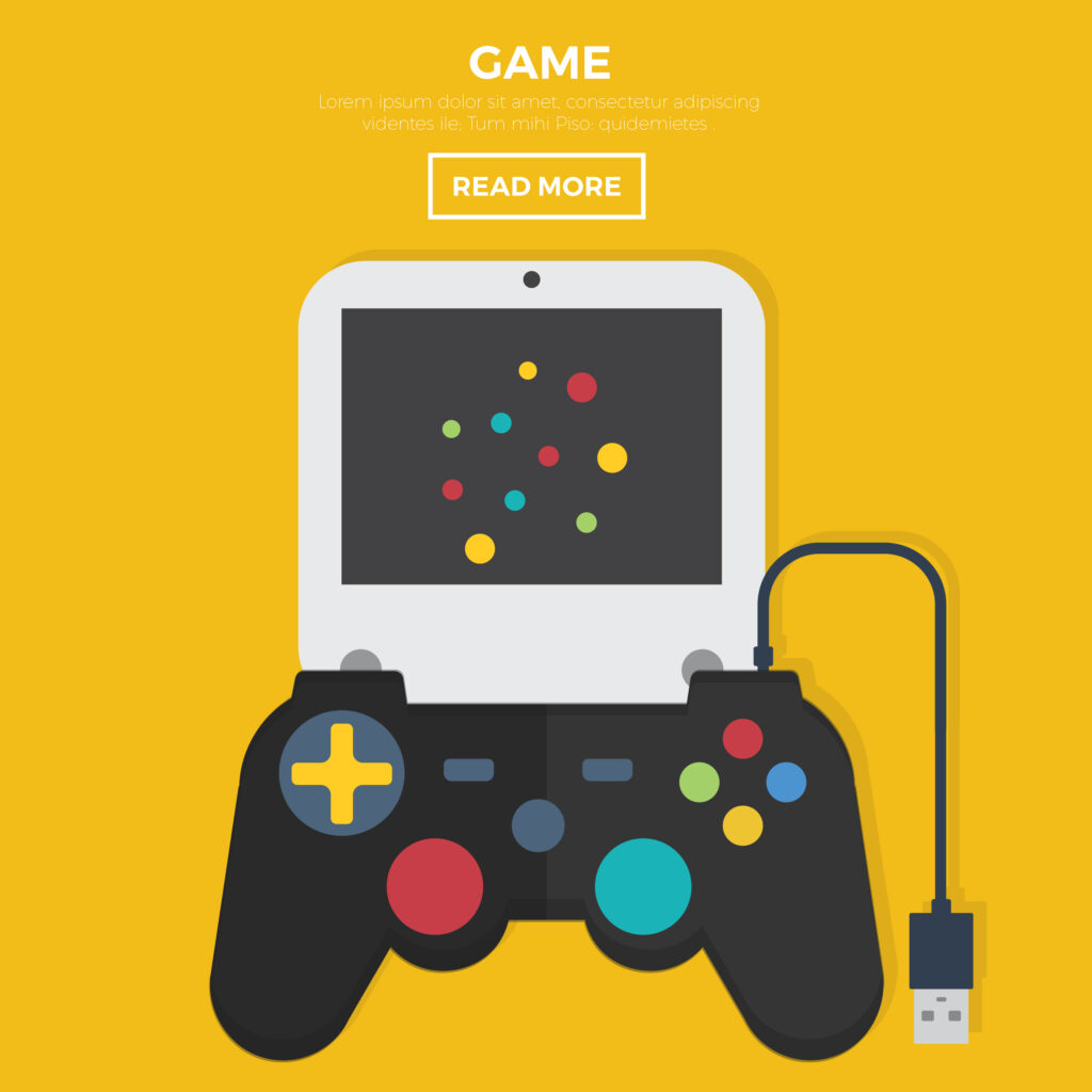
Ultimately, how functional your design or image is depends just as much on the format it will be viewed on as the content itself. Making sure to keep aspect ratio in mind when conceptualizing our images will help create images that not only look good but work well for their intended purpose.